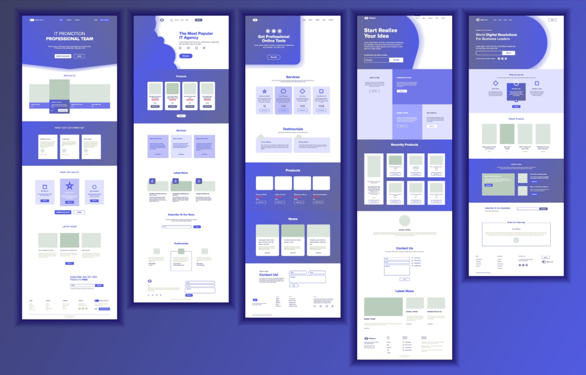
Picture this: you're at an industry event, passing out your business cards left and right to other owners and entrepreneurs. You're making small talk, discussing your services, and swapping contact information. But what happens when they decide to take a closer look at your B2B website? Will they be impressed by what they see, or will they quickly click away in search of another solution that better speaks to the challenges they face and the solution they seek?
As a B2B professional, your website is your virtual storefront - and it better be up to snuff. That's why we've compiled a list of the five essential pages that every B2B website needs. From articulating your UVP to establishing expertise to communicating that you understand your customer's pain points, these pages are crucial for attracting and retaining customers, building trust, establishing authority, and most importantly–moving them into and through the sales funnel.
5 Key Pages Essential to B2B Website Success
Many businesses launch with nothing more than a brochure-style website a simple 2-3 page site that has a home page, a product page, and a contact us page, but little else. It’s literally a digital brochure, all about the business, with no language or strategy dedicated to the customers who might land there. A B2B website should be set up like a flow chart, not an org chart. It has the potential to be an invaluable part of your marketing and sales team, but only if you set it up for success.
Home
Sure, every website has a Home Page. But do you know what its most important job is?
While a Home Page is vital for orienting visitors to who you are and what you do and letting them know they’ve landed in the right place, the most important job of a home page is to send visitors deeper into the site. An aesthetically pleasing site that sees decent traffic is useless to your bottom line if visitors are only spending 3 seconds there and moving on to other websites.
So find ways to meet buyers where they are and help them get to where they need to go. Brilliant website copywriting, can help here, as well as compelling CTAs that make it easy for visitors to move to other areas of the website without scrolling back up to the navigation bar. It can still be pretty. But it needs to be a workhorse too.
Cold
This page is called the Cold Page, or sometimes–the “Problems We Solve” Page–because it’s targeted toward website visitors who are just getting to know you and potentially, just beginning to understand the problem they need to solve. This is where you address the problem your ideal customer has. You speak to the elephant in the room. You let your audience know that you get it – that you see and understand the problem and that you have a solution.
The cold page is also where you’ll want to poke holes in alternative solutions. It is a good place to remind visitors of the consequences if they sit on their hands and do nothing. Throughout this page, be sure to weave your unique value proposition (UVP) into your messaging and position your solution against that of your competitors.
Warm
The Warm Page is for potential customers who understand their problem and are at least a little familiar with your solution. Warm pages are often titled, “How It Works.” Here you want to demonstrate what is different about your approach, clarify your unique value proposition, and explain how your solution solves their problem uniquely and completely. Here you can dive deeper into how and why it works, explain what’s included, and show how and why it’s effective. After visiting this page, it should be clear that your solution is distinctly different from your competitors. Finally, while this page references your product, it is less about features and more about process and outcomes.
Hot
This page, which is sometimes called the “Client Success” or “Results” Page is for buyers who are actively considering your solution. They are familiar with your product and are close to making a decision. The job of the Hot Page is to give them all the information they need to feel confident about their choice and eradicate any lingering doubts. You can bolster their confidence and boost your credibility with social proof such as testimonials from satisfied customers, case studies of particularly successful applications, and statistics showing results. Other great ways to provide proof include reviews from 3rd party review sites, industry awards, and any logos that demonstrate industry recognition or authority. This page is also a great place to provide details on any guarantees or warranties you offer. The goal is to eliminate all possible objections to keep them moving toward conversion.
Offer
Your Offer Page is your conversion page. It’s where your hardworking website delivers a qualified lead to your sales team and they’re off to the races. It’s important to note that all that effort into addressing customer objections, problems, and pain points will make your sales team’s job so much easier because these leads are already educated. That’s one of the biggest benefits of designing your website to function as a customer acquisition tool.
Remember, the goal of B2B websites is often to sell a meeting, not a product. But even then, buyers don’t want a sales pitch, and a “Contact Sales” button or a “Get a Consultation” form promises just that. So how do you craft a great offer page?
First, make booking a meeting straightforward and frictionless. Let them book time directly on your calendar at a convenient time for them. Second, emphasize what prospects will get for their time. Is it a strategy session? Is it an audit of a system or process? Is it answers to specific questions? Finally, make it clear that the meeting is free and zero-obligation. All it will cost them is time. And for that, they will receive valuable information, not a sales pitch.
But Where are the Product & Pricing Pages?
Don’t worry, these essential pages are in ADDITION to your product and pricing pages. But you can see the ratio here, right? The vast majority of your website is devoted to resonating with your ideal customer, not talking about your solution per se. The Cold, Warm, and Hot Pages are there to supercharge the product and pricing pages. Because when customers understand the true value of your solution, they will view your product and pricing in a whole new way. It’s a customer-centric approach that makes your B2B website more of a two-way conversation, rather than just a platform for talking about your products.
Ready to Take your B2B Website to the Next Level?
Your B2B website serves as the critical first impression for potential clients and customers. Each of the five key pages works collaboratively to guide visitors through the customer journey whether they’ve only just discovered you or are deep in the consideration phase. Just as you'd captivate your audience with articulate conversation and compelling business cards in person, your website should reflect your unique value proposition, address your customer's challenges, and ultimately, serve as an effective sales funnel. Remember, an engaging and comprehensive B2B website design is not just a luxury, but a necessity in today's competitive business landscape. It's your virtual handshake, your digital business card, and your online storefront all in one.
At Brand Theory, we approach B2B website design with a proven, systematic approach. We start by getting to know your business, understanding your ideal customer and UVP, examining your competition, and perfecting your messaging. Only then do we shift to designing your website. In a streamlined but comprehensive process that takes as little as 12 weeks, we deliver effective B2B websites that are tailored to your unique product or solution and designed to meet your customers at every stage of their journey. Learn more about our comprehensive approach to growth marketing for B2B brands by booking a no-obligation introduction to Brand Theory today.


.png)
.png)
.png)